IDE usability improvements
2017-03-05
Uploading into empty file
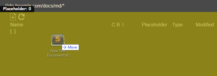
Uploading into an empty file was a bit inconvenient, because no files where shown, thus you could not upload files relative to them. You had to go a level up, then upload into the parent file.
Now the entire navigation area is a dropzone for the parent file, making file uploads easier.

Making the [..] file responsive
Until now, the [..] file only supported navigation: going a level up. But moving files a level higher in the hierarchy was a bit clumsy: you had to first cut the file, then go 2 levels up, paste into the grandparent, then enter the grandparent to see the file you pasted. Ehm.
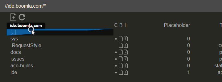
Now you have 2 options. You can drop it relative to the parent file represented by the [..] entry in the listing.
Please note that you will not see an icon for the [..] file, which is intentional. It’s simplty a drop target. Note on developers: to support this, new user interface classes were introduced: .o1-file-none, .o1-file-no-icon, .o1-file-no-drop, .o1-file-no-structure.

Best,